|
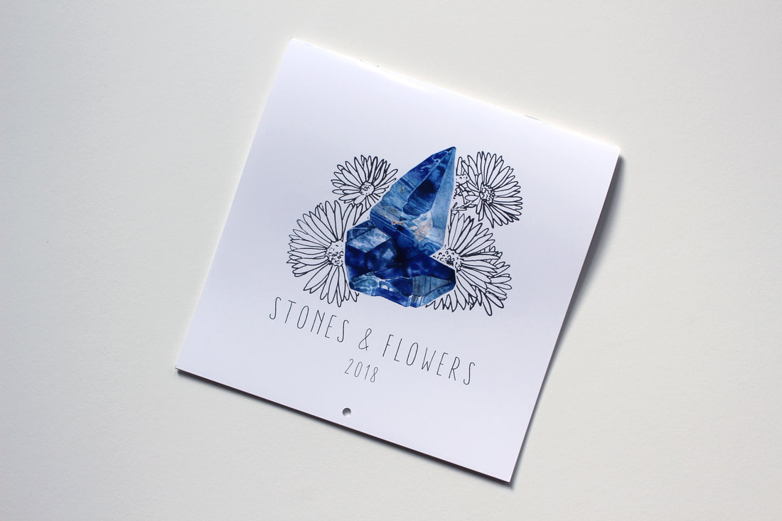
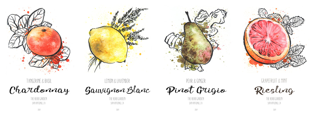
If you've been keeping in touch with my instagram, you'll know that the end of the year was a whirlwind for me! Though if you haven't, I'd definitely advise you follow it (meofsharick.illustration), because that's where I'm most actively posting on a regular basis. Anyway, the reason the end of the year was so chaotic was due to a last minute Kickstarter I activated in order to sell calendars featuring my series of birthstone designs. It was successfully funded and I'm thrilled to see my calendars being used by real people! If you missed out, don't worry. I'm hoping to potentially reprint the calendars next year, and maybe even design a new one as well! So onto new things. With the new year and my completed birthstone series, I had to ask myself what my next project would be. I had been fairly content with the way that the birthstone designs had turned out. I was really enjoying the feel of having a colorfully rendered stone, while also having the simplicity of ink lines in the flowers; I wanted to explore this aesthetic more. At the same time, I had been feeling a bit inspired at work, where I'm regularly pouring wine and serving beers to customers. I've always had an interest in the product artwork of wine and craft beer bottles, and being that I enjoy working with food illustration, I thought this might be a good avenue for me to explore. For me, one of the things I look for when picking out wine is definitely the packaging. While I understand that this is a perfectly illogical way to choose a good wine, I also know that it's something that many average shoppers are also attracted to when browsing. Looking at it from the perspective of someone who doesn't drink much wine, and certainly doesn't know how to pick a good one out, it made it easier for me to place myself in that situation and visualize what sort of label would be eye-catching to me. This is where my style of colorful watercolor and detailed ink lines come in. If it were me, I know I've very attracted to minimalist, white background, but still very colorful and detailed illustration. Being that I enjoyed the inked botanical floral illustrations from my calendar, I thought that incorporating herbs into my wine label series could fulfill a similar aesthetic. But this meant I would also need something to fulfill the colorful aspect, which meant I would have to come up with a fruit pairing as well. Being that I'm certainly no wine connoisseur, I knew this meant I would have to do a lot of research to make sure my flavor profiles were fairly sound. After several days of creating lists and lists of compatible fruits and wines, herbs and wines, and fruits and herbs, I'd finally come up with a unique pairing for each of 12 wines and 2 sangrias. They're a little funky, and I'm sure a little out-there for some, but I feel they'll work well enough to serve their true purpose, which is adding to my design portfolio. After completing this list of wines, there will also be a second series of craft beers - this time the theme will be the solar system. While this project may be helping me add to my design portfolio, it's also teaching me much about loosening up my technique and forcing me to be not as obsessive over perfection. Which is slowly leading to a bit more dynamism in my work as well. Stay tuned for the rest of the wine and the beers!
0 Comments
Leave a Reply. |
Morgan OfsharickJust a little spot where I try to offer helpful tips and insight on how to achieve your best photo session, and also some occasional art discussion as well! Categories
All
|
|
Lifestyle Portrait Photographer | Coventry, Connecticut
[email protected] | @gold.thistle.photo © Copyright Gold Thistle Photo 2024 |
|


 RSS Feed
