|
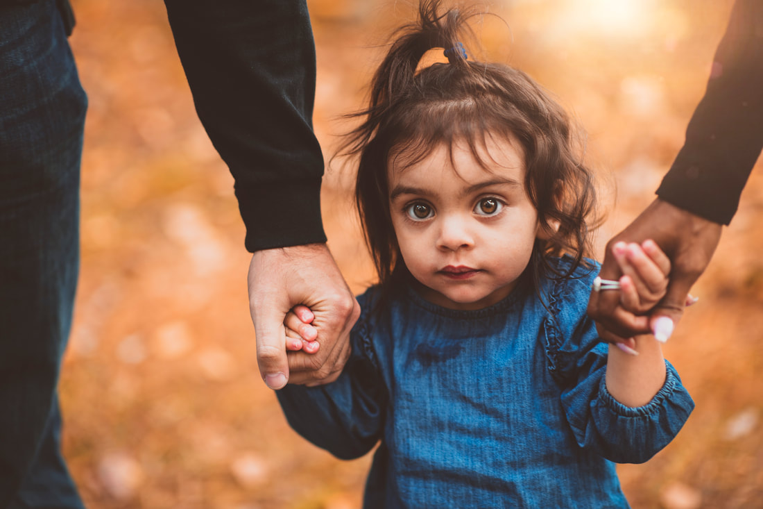
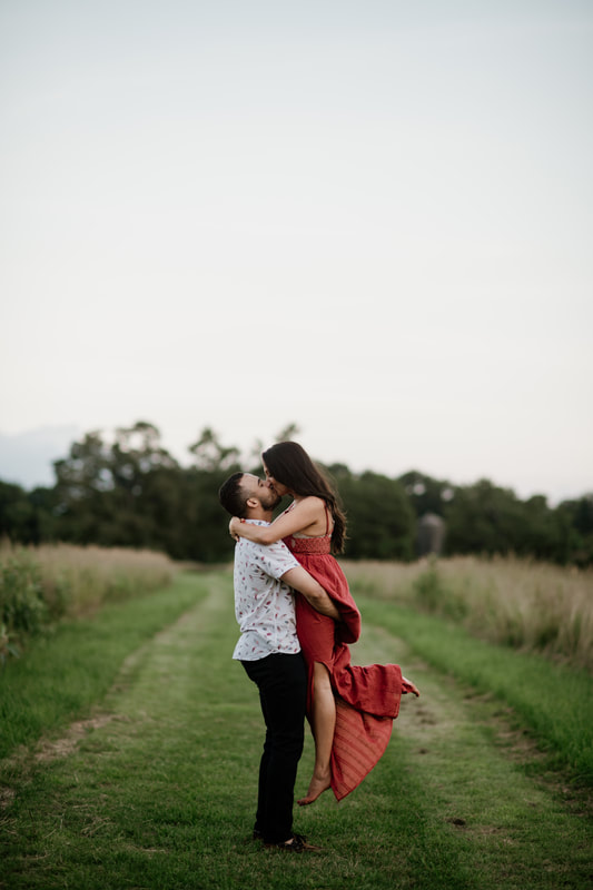
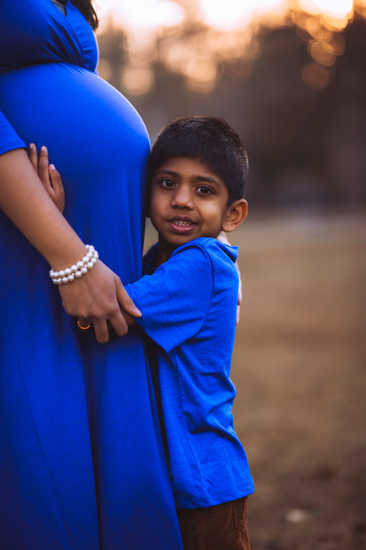
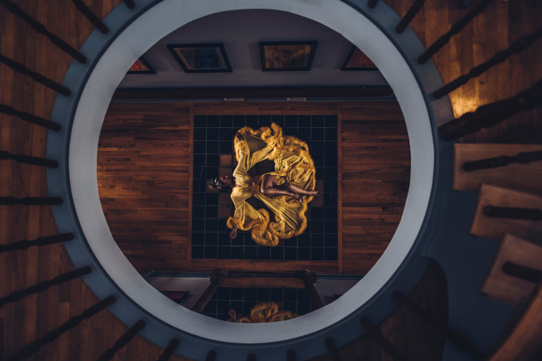
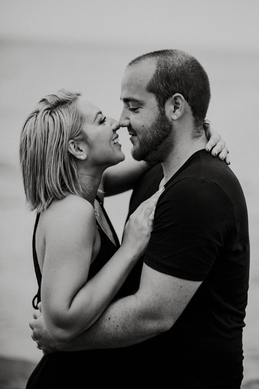
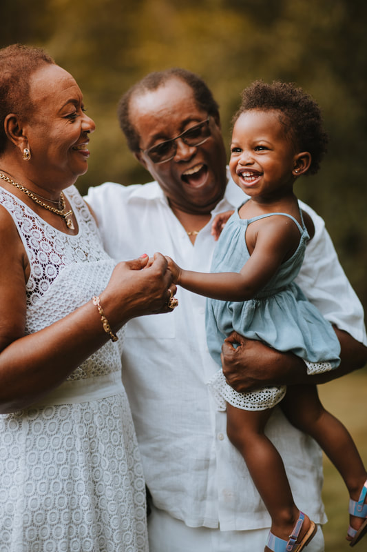
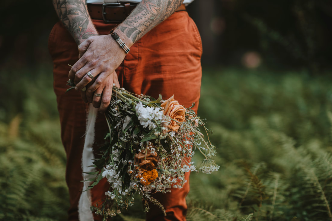
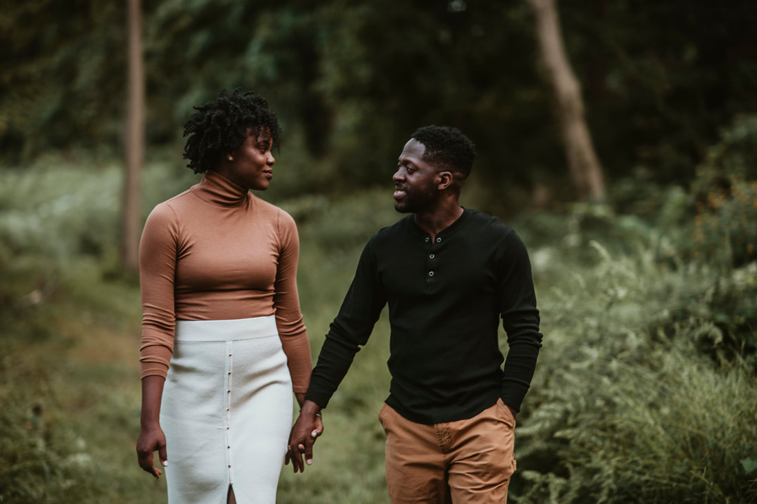
Hello and welcome to What Should I Wear Wednesday! Though I've already made a blog several months ago giving general advice on how to pick your outfit (which you can read first here), I wanted to go a little bit further in depth about how color plays a big role in creating stylish photos. So, I'm going to take you back to my days in a fine arts academy and talk about color theory! The best way to understand color is to start with the basics – the primary colors are red, blue, and yellow. These are colors that cannot be mixed or created by any other colors, but you can use them to create new colors. The three secondary colors are orange, green, and purple. These are the immediate colors that can easily be created using combinations of the three primaries; red and yellow make orange, yellow and blue make green, and red and blue will make purple. We want to think of color as a circle – red flows into orange, to yellow, to green, blue, purple – and then back into red. Infinitely and seamlessly. Now, you can pick any point in this circle; the color directly opposite of it is known as its complimentary color. Directly across from red is green (blue+yellow), yellow is across from purple (red+blue), and blue is across from orange (red+yellow). This would also apply to tertiary colors – reddish-orange versus greenish-blue – and so on, but you get the idea. So, how can all of this help us choose an outfit color if we want something to make our Instagram pop? Below, I'm going to list all of my personal favorite colors that I'm always excited to see my clients wearing. 1. RedFirst and foremost, I'm going to start right off the bat by saying I've never been upset to see my clients wearing red. It's my favorite color! Whether it's a bright, bold red or a dark, wine red, you can never go wrong with it. Red makes a statement; it's striking, and stands out in essentially any environment. Why is this? Because red doesn't occur in nature very often, save for flowers, so in comparison to greens, browns, and grays that we easily find in nature, red is going to call attention to the subject. Whether it's a salmon red in a field, a bold red dress on the beach, or a festive red sweater during the holiday season, it always shows up beautifully through the lens. Red is just so bold and romantic, and I'll love you if you wear it! 2. Royal BlueNow here's a color that I absolutely love in the colder seasons – bold blue. Here in Connecticut, our winters on the shoreline are often on the damp side; needless to say we don't often see white Christmases, but quite a few chilly brown ones. While some may feel dead February foliage isn't very appealing, I feel quite the opposite. I have a soft spot for bare branches and sleeping grass, and that's mainly because I love the muted, golden backgrounds it provides. So when this family rolled up all decked out in royal blue, I couldn't have been more ecstatic. Remember, the opposite of blue is orange, so this brown scenery with a bit of golden sunset light filtering through the trees was the perfect match. Oh, and not to mention blue looks stunning on darker skin tones for the same exact reason! 3. Golden YellowNow here's a color I think can be a little underrated – a golden, sunflower yellow. Normally I would consider red to be the most romantic color, but during the boudoir shoot in this mansion above, my client proved me wrong. Yellow can absolutely be a statement color in the right setting! In this situation, the yellow was harmonizing with the wood, and also complimenting the blue trim. According to the color wheel, the opposite of yellow is technically purple. While we may have a hard time finding much purple naturally occurring in nature, blue and grey are a close second. An ideal photoshoot I've always wanted to do would be a moody, grey day on a rocky shoreline (which Connecticut has no shortage of) with a yellow dress or skirt; even someone with bright blonde hair alone would be stunning. I hope someone takes me up on it one day! 4. Black and WhiteWhen it comes to timeless-looking black and white photos, my color preferences are simple – wear black or white! Even though you can obviously wear color for black and white photography as well, there's something extra compelling about actually wearing stark black or white. The couple above was one of my very first photoshoots and to this day, these are some of the most striking photos I've taken. As for the family on the right, I loved the way the white linens contrasted with their skin tone! White and denim is always a classic look for the summer and very hard to mess up; not to mention, who doesn't own something white or denim? 4. Rustic colors and NeutralsNow that we've gone over all of the primaries, let's touch on some more interesting colors! Other shades that I LOVE for photography are burnt orange, dusty rose, teal, fawn brown, olive green, mustard yellow, and other rich earthy tones. I think shades like these are beautiful for more artistic, indie photography. I also feel that because they're muted tones, they're pretty flexible for most seasons and look stunning around both golden sunset lighting or cool misty days – think rocky shorelines, dune grass, rugged mountain tops, overgrown meadows, or even the desert. In the photo above, I'm loving how that burn orange looks against the green ferns! And in the photo below, wow; who knew black, white, and fawn brown could look so fashionable. Such simple outfit coordination for adorable results! 5. Colors I don't recommend.And finally, I wanted to leave off with colors that are my least favorite. Take this with a grain of salt of course, because all of this is based on my personal taste and style of photography; my absolute least favorite colors are generally anything flamboyant, particularly pinks and purples and aquas. I'm also not always a fan of pastels besides denim or nudes (though you might be able to prove me wrong on this!). While I think bright colors can sometimes look good in summer weather, tropical locations, or in urban street photography, most of the time they just don't fit in with the style of photography I do. I don't know what it is about flamingo pink or fuchsia purple in particular, but they are my least favorite colors on the planet and I try to avoid them like the plague in my work. My goal is always to deliver my clients the best representation of my style, and I just find these shades a bit too loud and abrasive. So there you have it! These are all of my favorite (and least favorite) colors to work with in photography – primaries, rich indie tones, and black and white are all colors I feel I could give you the most success with. Another thing worth mentioning is that style and presentation matters too – this means that overly casual clothing may not get you the results you're looking for, even if they're the right colors. For example, I don't advise anything with logos, writing, graphics, leggings with crazy designs, hoodies, windbreaker jackets, or most sneakers. For stylish portraits, you generally want to be dressing presentably for a job interview or a fancy restaurant. Nice sweaters, classy shoes, and if it's cold, a more formal coat. If you're going for more indie and rugged portraits, ripped jeans, flannels, and boots look great when dressed up with accessories. Always aim for dressy casual at minimum – we want to look like we're going to a photoshoot, not your nephew's little league game! And as I mentioned in my previous clothing post, you always want to match or coordinate outfits for portraits of multiple people. This could mean a family of ten all wearing flannels and denim, or maternity portraits with the mother dressed in red and the father dressed in neutrals with a red accent. My favorite trend of weddings has been seeing bridesmaids all wearing different shades of the same color – sage green, forest green, olive green, teal green – coordinated, yet artsy! Again, my biggest recommendation has been and will always be, take this new knowledge about colors and do some quick searches on sites like Pinterest. Try terms like "engagement photography", "autumn family portraits", "indie maternity photography", and take note of their clothing, accessories, and setting. When you find ideas you like, you can find similar tones in your wardrobe and seek out areas near you where you might be able to replicate the foliage and background. Now just find a photographer whose editing style is close to what you're looking for, and then wow them when you show up dressed like a pro! Morgan Ofsharick specializes in business headshots, proposal, engagement, wedding, maternity, newborn, and family portrait photography, servicing New Haven, Fairfield, Hartford, Middlesex, Litchfield, and plenty of other regions around Connecticut! –MEO Photography
0 Comments
Leave a Reply. |
Morgan OfsharickJust a little spot where I try to offer helpful tips and insight on how to achieve your best photo session, and also some occasional art discussion as well! Categories
All
|
|
Lifestyle Portrait Photographer | Coventry, Connecticut
[email protected] | @gold.thistle.photo © Copyright Gold Thistle Photo 2024 |
|

 RSS Feed
